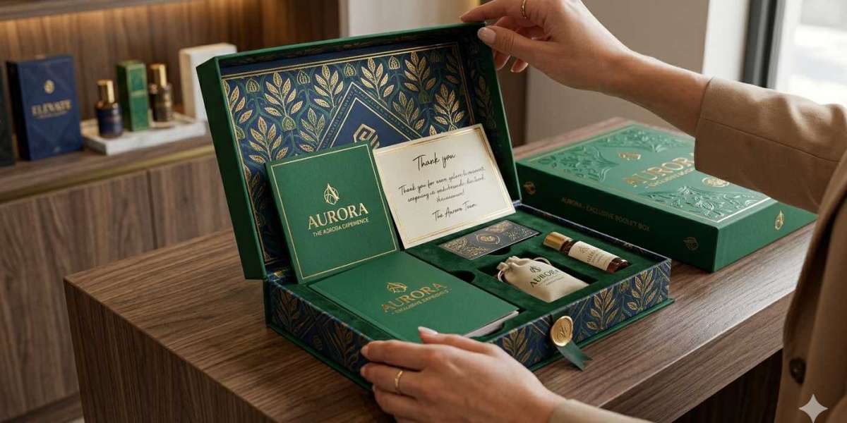
A booklet box has one job that most brands underestimate: it has to earn a second look. We have packed, shipped, and unboxed thousands of these boxes over the years, and the pattern is clear. The boxes that sell are not the ones with the biggest budgets. They are the ones built with intention.
In this guide, we walk you through nine ways to make your booklet boxes stand out. You will learn how to choose the right materials, use color and finish to your advantage, and avoid the small mistakes that quietly cost sales. Here is what we cover:
- Smart structural design and box style
- Materials, finishes, and printing choices
- Branding details that build trust
- Cost control without cutting corners
Let's get into it.
What Is a Booklet Box (and Why Design Matters)
A booklet box is a printed carton designed to hold a booklet, manual, sample kit, or thin product alongside printed information. You see them in cosmetics, supplements, electronics, and subscription kits. They combine storage with storytelling, which is exactly why design choices carry so much weight.
We have seen identical products perform very differently based on the box alone. The reason is simple. Shoppers decide in about three seconds whether to pick something up. Your box is doing the selling before anyone reads a word.
Here is how the nine methods break down at a glance.
# | Method | Main Benefit | Effort Level |
1 | Pick the right box style | Better fit and shelf presence | Low |
2 | Choose sturdy materials | Protection and premium feel | Medium |
3 | Use strategic color | Faster recognition | Low |
4 | Add special finishes | Tactile, memorable surface | Medium |
5 | Design clear typography | Easy reading and trust | Low |
6 | Build a strong unboxing | Repeat purchases and shares | Medium |
7 | Add functional features | Convenience and reuse | Medium |
8 | Stay eco-friendly | Customer goodwill | Medium |
9 | Control your costs | More margin to reinvest | Low |
1. Choose the Right Box Style for Your Product
The style sounds like a minor detail until your booklet slides around inside an oversized carton. A loose fit looks cheap and damages the product in transit. The right style holds the contents snug and frames your branding the way you intended.
We recommend matching the style to how the box will be used and displayed.
Common Booklet Box Styles
- Tuck-end boxes: Quick to assemble and budget-friendly. Best for retail shelves with steady restocking.
- Sleeve boxes: A slide-out drawer with an outer wrap. They feel premium and protect well.
- Magnetic closure boxes: Rigid and reusable. Ideal for high-value kits and gifts.
- Two-piece boxes: A separate lid and base. Strong, classic, and great for sample sets.
How to Pick
Start with three questions:
- How will the box ship and display?
- What unboxing feeling do you want?
- What is your per-unit budget?
If you ship a lot of units and need speed, tuck-end boxes win. If you want the box to feel like a gift, a magnetic or two-piece style earns the extra cost.
Common mistake: Ordering a style based on a competitor photo without checking your booklet's exact dimensions. Always prototype with your real product first.
2. Invest in Sturdy, High-Quality Materials
Material quality is the difference between a box that arrives crisp and one that arrives dented. Customers read damage as carelessness, even when the product inside is perfect. Strong material protects both your contents and your reputation.
Thoughtful Booklet Packaging starts with choosing the right board weight and type for the job. We match material to the product's weight, value, and shipping path.
Material Comparison
Material | Best For | Strength | Relative Cost |
SBS paperboard | Retail booklets, cosmetics | Medium | Low to medium |
Kraft paperboard | Eco-focused brands | Medium | Low |
Corrugated board | Heavier kits, shipping | High | Medium |
Rigid board | Luxury, gifts | Very high | High |
Our Rule of Thumb
- For lightweight booklets under shelf conditions, SBS at 14–18 pt works well.
- For mailer journeys with bumps and drops, add corrugation or step up to rigid board.
- When in doubt, order a sample run and drop-test it before committing to thousands of units.
We stand behind one principle here: never save a few cents on board if it means returns and refunds later. The math rarely favors the cheaper stock.
3. Use Color Strategically
Color is the fastest signal your box sends. Shoppers recognize a color block before they read a logo. That is why brands defend their signature shades so fiercely.
We treat color as a tool, not a decoration. Each choice should support recognition and the mood you want to create.
Color Tips That Work
- Lead with one dominant color that ties to your brand. Use one or two accents only.
- Match color to category cues. Soft tones suggest calm and wellness. Bold tones suggest energy.
- Check contrast so text stays readable in store lighting.
- Request a printed proof. Screen colors and printed colors rarely match exactly.
Print Color Modes
Mode | Best Use | Note |
CMYK | Full-color images | Standard for most boxes |
Pantone (PMS) | Exact brand colors | Consistent across runs |
Mixed CMYK + PMS | Photos plus brand color | Higher cost, sharp results |
Quick action: If your brand color must stay identical across every batch, specify a Pantone match in your print file. This single step prevents the slow color drift that confuses loyal customers.
4. Add Special Finishes and Coatings
A flat printed box does the job, but finishes turn it into something people want to touch. Texture and shine signal quality before the lid even opens. The trick is restraint.
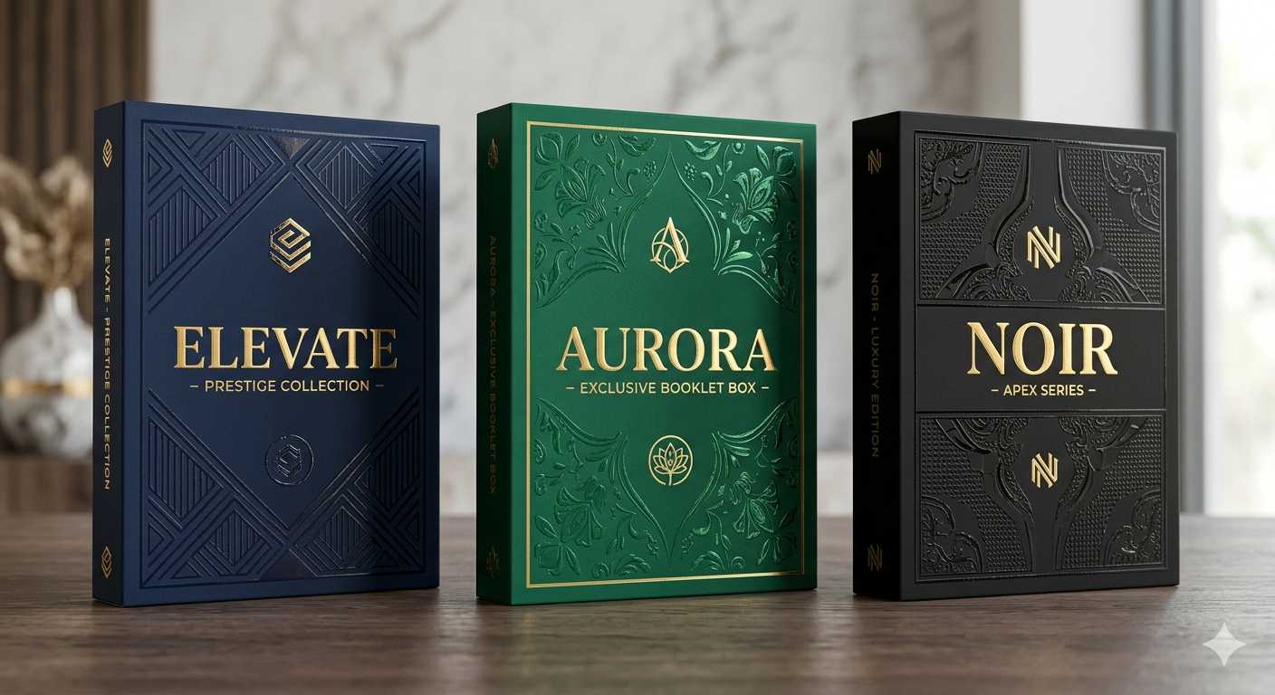
We use finishes to highlight one or two elements, not the whole surface. Too many effects compete and the design loses focus.
Finishes Worth Considering
- Matte lamination: A smooth, low-glare surface that feels modern and hides fingerprints.
- Gloss lamination: Adds shine and makes colors pop. Great for vibrant designs.
- Spot UV: A glossy coating on select areas, like a logo, against a matte background.
- Foil stamping: Metallic gold, silver, or color foil for a premium accent.
- Embossing or debossing: Raised or recessed shapes you can feel.
How to Combine Them
Pair a matte base with a single bold accent. For example:
- Matte box plus gold foil logo
- Matte box plus spot UV product name
- Kraft base plus blind emboss pattern
Common mistake: Stacking foil, embossing, and full gloss on one panel. The result looks busy and raises cost fast. Choose one hero detail and let it lead.
5. Design Clear, Readable Typography
Typography is where many boxes quietly fail. The design looks great in a mockup, then the legal text becomes unreadable at actual size. Clear type respects the reader and builds trust.
We organize text into a clear hierarchy so the eye knows where to go first.
Typography Hierarchy
- Brand name or logo: Largest and most visible.
- Product name: Second in size, easy to scan.
- Key benefit or tagline: Short and supporting.
- Details and legal text: Small but still legible.
Practical Rules
- Use no more than two typefaces.
- Keep body text at a size readable from arm's length.
- Leave white space so panels do not feel crowded.
- Avoid placing thin text over busy images.
Reader prompt: If you are unsure whether your text is readable, print the panel at 100% size and view it across a room. If you squint, simplify.
6. Create a Memorable Unboxing Experience
The unboxing moment is your second sales pitch. The first sold the purchase. This one earns the repeat order and the social post. A flat interior wastes that chance.
We design the inside of the box with the same care as the outside.
Ways to Improve the Inside
- Printed interiors: Add a message, pattern, or instructions on inner panels.
- Inserts: Custom trays or dividers hold the booklet and product in place.
- Thank-you notes: A small card adds a human touch.
- Reveal sequence: Design the open so the brand element appears first.
Why It Pays Off
A strong unboxing does three measurable things:
- Increases the chance of social sharing.
- Reduces the feeling of buyer's remorse.
- Builds the emotional link that drives repeat purchases.
We have watched simple inserts and a printed inner lid turn one-time buyers into subscribers. The cost is small, and the payoff compounds.
7. Add Functional and Practical Features
Looks get attention, but function keeps the box useful after purchase. A box that is hard to open or impossible to reseal frustrates people. Smart features remove that friction.
We add practical touches that fit the way customers actually handle the box.
Useful Features to Consider
- Easy-open tabs: Help customers open without tearing.
- Resealable closures: Let customers store the product again.
- Hang holes: Allow display on retail pegs.
- Window cutouts: Show the product or booklet cover.
- QR codes: Link to setup guides, videos, or reorder pages.
Match Features to Use
Feature | Best For | Customer Benefit |
Easy-open tab | Frequent-use products | Less frustration |
Resealable flap | Multi-use kits | Reuse and storage |
Hang hole | Retail pegs | Better visibility |
QR code | Tech and supplements | Instant support |
Quick action: Add a single QR code that links to a how-to video. It reduces support requests and keeps customers engaged after the sale.
8. Go Eco-Friendly With Affordable Custom Packaging
Sustainability is no longer a niche request. Many shoppers now check materials before they buy, and they reward brands that make greener choices. The good news is that eco-friendly does not have to mean expensive.
You can achieve Affordable Custom Packaging while still cutting waste and meeting buyer expectations. We focus on choices that lower impact without inflating the per-unit price.
Eco Choices That Make Sense
- Recycled board: Uses post-consumer content and often costs the same as virgin stock.
- Soy or water-based inks: Lower the chemical load with little price change.
- Right-sizing: A box that fits the product cuts material and shipping cost at once.
- Minimal finishes: Skipping heavy lamination makes recycling easier.
Communicate It Clearly
If your box is recyclable, say so plainly:
- Add a simple recycling symbol.
- Print a short line like "Made with recycled board."
- Avoid vague claims you cannot back up.
Trust note: Only print an eco claim you can verify. Shoppers and regulators both punish greenwashing, and one false claim damages trust you spent years building.
9. Control Costs Without Cutting Quality
Standing out should not drain your margin. The mistake we see most is treating cost and quality as enemies. Handled well, they work together. Smart planning lets you spend where it counts and save where it does not.
We help brands trim cost in ways customers never notice.
Smart Ways to Save
- Order in volume: Higher quantities lower the per-unit price sharply.
- Standardize sizes: Fewer dieline variations reduce setup fees.
- Limit special effects: Use one hero finish instead of three.
- Plan ahead: Rush orders cost more. Forecast and order early.
Where Not to Cut
- Board strength on shipped products.
- Print proofs before a large run.
- Pantone matching for signature brand colors.
Decision | Save Here | Spend Here |
Board weight | Light retail items | Shipped, heavy items |
Finishes | Inner panels | Hero logo or name |
Quantity | Bulk orders | — |
Proofing | — | Always proof |
Common mistake: Cutting the proof step to save time. A bad print run costs far more than a single proof ever will.
Bringing It All Together
You do not need every method on this list to stand out. You need the right few, chosen for your product, your shipping path, and your budget. Start with structure and material, then add one or two finishes and a strong unboxing moment. From there, refine color and typography until the box reads clearly at a glance.
Here is the main takeaway: a box that stands out is a box built on purpose, not on guesswork. Pick three methods from this guide, prototype them with your real product, and test how the box looks and feels in the hands of an actual customer. That single step tells you more than any mockup ever will.
Frequently Asked Questions
What size should my booklet box be?
Measure your booklet or product at its widest, longest, and thickest points, then add a small tolerance so it fits snugly without sliding. We always prototype with the real product before locking in a dieline, because paper specs on screen rarely match the physical fit.
How much do custom booklet boxes cost?
Cost depends on size, material, quantity, and finishes. Volume is the biggest lever. Ordering in larger runs lowers the per-unit price sharply, while extra finishes like foil and spot UV add cost. Standardizing your size and limiting special effects keeps prices reasonable.
Which material is best for shipping booklet boxes?
For boxes that travel through the mail, we recommend corrugated board or rigid board. Both handle bumps and drops